Accessible Notes - Template
These notes are to provide the standard practices & formats that should be used to improve the accessibility of any new notes on the EM/P-Cubed wiki pages.
Text
1. Consistent use of headings
2. Consistent use of bold, italics, & underline
3. Links to previous, upcoming, or outside material
Figures & Diagrams
1. Check figure for color & texture use
When using figures, colors should be chosen carefully and color should not be the only way to distinguish between important features of a diagram/figure. When making a figure, you should choose colors that have high contrast with the different forms of color blindness and define important contrast with textures.
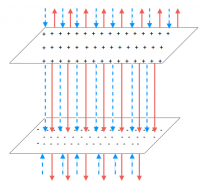
For example, in the figure to the left, red-solid arrows are representing the electric field from the positive plate of charge and blue-dashed arrows represent the electric field from the negative plate of charge. So we are using both the color and textures to distinguish the meaning of the arrows.
When picking colors, there are several resources that have predefined color palettes that have contrasting colors for people with and without colorblindness. These resources give HEX numbers and RGB numbers for each color that are easy to add to Paint, MS word or powerpoint, inkscape or any other image creator.
- https://davidmathlogic.com/colorblind/ – This resource provides a good overview and an interactive simulation where you can see what colors would appear like for three different versions of colorblindness. You can add various colors to test their contrast. At the bottom of the page, it offers pairs of colors that are high contrast (with HEX & RBG numbers) and links to predefined color palettes.
- https://www.nature.com/articles/nmeth.1618 – This is a published research column that outlines a particular color palette that is distinguishable for 2 types of red-green color blindness. It includes RGB & CMYK numbers for each color.
- https://personal.sron.nl/~pault/ – This resource provides multiple color palettes with RGB & HEX numbers that will still provide contrast for color blind individuals. Each palette has a thorough caption for what the palette can and should be used for.
Motivation/Reason for this check: Roughly 1 in 20 people have some form of color blindness, so it is likely that some of your students each semester are color blind. When color is the only distinguishing factor in a figure, it prevents a person who is color blind from understanding or interpreting important information from that figure.
Guidelines this measure satisfies:
- MSU Checklist - Text and Contrast, Text Styles
2. Descriptive caption for figure
Each figure should have a descriptive caption that describes what information the students should get out of the figure. This description should be sufficiently describe the the important features of the figure & any take away information so that if someone could not see the figure itself, they could still understand the important information. That said there is a balance between detail and length. Common guidelines suggest keeping captions between 140-280 characters (1-3 sentences).
For example, in the figure above, the caption used to be “Electric field between two parallel plates”. This is insufficient to understand what the arrows represent in the figure. The current captions better describes the electric field.
Resources:
Motivation/Reason for this check: Many students may be using screen readers to have the webpages read aloud for them. This includes students who are blind or have vision impairments and students who have trouble reading or focusing on written work (e.g. students with dyslexia, dyscalculia, ADHD, etc.). Screen readers may also be used by students who simply prefer to hear information rather than read it.
When screen readers encounter an image, they will simply say “image” or “image1_2.jpg”. It is important to include a descriptive caption so if someone could not see the image, they could get the same information from the caption that should be conveyed in the image.
Guidelines this measure satisfies:
- UDL Guideline 1.3 - Offer alternatives for visual information
- MSU Checklist - Alternative Text
